
Quick Tips on Accessibility
Prioritizing Accessibility Helps Everyone
The fact is, not all of your potential viewership will find your designed content accessible. In the design world, we’re seeing a rising trend toward accessible style choices. High contrast color combinations, large, clear fonts, and an overall clean simplification are a few examples of accessible design evolution. These styles are important to consider when you’re in the process of, for example, creating an accessible flier for an OIT event.
Think about small changes you can make to integrate accessibility into a document, such as choosing a color scheme that provides high contrast between text and background colors, editable text rather than text embedded in an image, and descriptive link text that provides the context of a url destination.
By making these changes, the end result is a document that is not only 508 compliant, but also helps everyone access the content and information they need. Applying some simple accessibility practices to your daily work will create a more inclusive digital space and save you time, helping you avoid excess rework due to accessibility remediation.
Let’s Explore Accessible Practices and How They Can Help Everyone
Make your web design, presentations, writing, and electronic messages and documents more accessible in 2024 by applying the below best practices. While the practices aren’t inclusive of all accessibility and 508 compliance principles, they’re a general guide to get you started in helping everyone access the content they need:
- Structure content in a linear way:
- Accessibility best practice: When creating a presentation, document, digital mural, or website, organize the content from the top down and left to right, the same order a screen reader uses to navigate the page. Use bullets, numbers, whitespace, and multimedia elements to break up the content.
- How this improves user experience: Users can easily find the information they need with lists, clear subheadings, and images or videos.
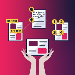
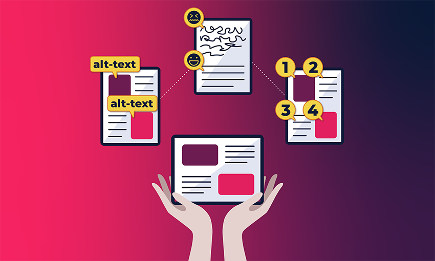
- Provide alternative text or ‘alt-text’ for images, infographics, and other visual elements:
- Accessibility best practice: Provide closed captioning for audio content and turn on the closed captioning option in a Slack huddle. Many OITers exchange messages on Slack daily. Use the built-in alt text feature to provide an image description.
- How this improves user experience: Closed captioning and alt text optimize search results and make content accessible to people with hearing and vision impairments and those who speak English as a second language.
- Choose high contrast between the background and foreground colors:
- Accessibility best practice: Select colors with sufficient contrast for the body text, text within images, (4.5:1 for regular size text, 3:1 for large), background, and links. Avoid relying on color to represent information (e.g., data) and avoid embedding text within images whenever possible.
- How this improves user experience: All users benefit from easy-to-read contrast. It also helps a user with low vision or someone without adequate lighting.
For more information on accessibility best practices, read our Building a More Accessible OIT series.