
Picturing Accessibility: Best Practices for Making Mural Accessible
Imagine: your next team meeting is this week. You need a place for everyone – remote and in-office workers – to meet and collaborate. You decide Mural’s digital whiteboard may be the most effective tool, but want to ensure your work is accessible.
What does a more accessible mural look like? Where do you begin?
In this article, we demonstrate how Web Content Accessibility Guidelines (WCAG) and other tips can create more inclusive and collaborative Mural sessions. If you’re unfamiliar with Mural, check out some helpful Mural terms and definitions in our checklist.
BUILDING ACCESSIBLE FOUNDATIONS
A more inclusive Mural starts with proper formatting, layout, and scaling.
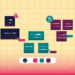
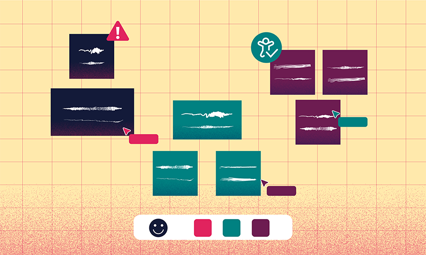
Lay it Out: Left to Right, Top to Bottom
Determine the layout before you add content to the canvas:
- Create a logical, linear layout that reads from left to right and top to bottom.
- Group content by topic and use headings, subheadings, and whitespace to differentiate sections.
- Add topics to the outline so that users can easily jump to any section.
- Provide instructions in each section as needed.
- Create a separate section to store all links for easy access.
Use the ready-made templates in the Mural template library if you need help.
Scaling Up to Accessibility
Mural elements (e.g., notes, connectors, icons, shapes, and other items) were created with accessibility in mind. If you’re unsure about scale, use the default-size canvas and elements.
If you decide to use your own scale, follow these tips:
- Size elements to at least 44 px (width) x 44 px (height) when zoomed in 50% to 60% (many elements, such as sticky notes and shapes, display their size when a user drags the element’s border across the page).
- Zoom in on the canvas to 100% to determine whether components like text size and color contrast meet accessibility requirements.
LET WCAG BE YOUR GUIDE
Apply the following WCAG to your mural:
Reach Great (Font) Heights
Select Mural’s default font, Proxima Nova, for an accessible sans-serif font. Keep in mind, Mural menus don’t provide text size:
- WCAG recommend using text no smaller than 9 points.
- The default text size within a mural element (when zoomed to 100%) is comparable to a 12- to 14-point font.
- Text size will shrink as more text is added to a sticky note, so use caution.
Know What to Say and How to Say It
Ensure participants feel included, know what each section of your mural addresses, and where each link leads:
- Write with people-first language and plain language in mind.
- Create descriptive links (e.g., link “PlanetOIT” instead of “click here”), headings, and subheadings.
Contrast in Color
Choose colors with sufficient contrast for the body text, text within images, (4.5:1 for regular size text, 3:1 for large), background, and links. Avoid relying on color alone to represent information (e.g., data):
- Apply labels to colors.
- Supplement colors with patterns, shapes, icons, connectors, and stickies.
Picture Accessibility
Images and GIFs require a text alternative so that people who are blind or have low vision understand the content of an image. To make images or GIFs accessible in Mural, add captions and descriptions.
GIFs should be used with caution:
- Limit the number of GIFs to no more than one or two to prevent cognitive overload.
- Choose GIFs carefully as they often feature automatic blinking, flashing, or strobing content that can cause seizures in people with photosensitive epilepsy.
- Avoid GIFs that flash more than three times per second, play automatically or for more than five seconds, or those that can’t be paused, stopped, or hidden.
Read the article Best Practices for Accessible GIFs in Mural for more information.
In Your (Mural) Element
In general, the default size and the widest (or thickest) border option of an element are accessible when correctly scaled and colored. When in doubt, copy the ready-made color samples, text sizes, shapes, and other elements straight from Mural’s template, Accessibility Best Practices for Mural Facilitators.
Additionally, you can employ the lockdown feature to keep elements in place and prevent participants from moving them accidentally.
FACILITATE INCLUSION
Use these tips to facilitate a more accessible and inclusive mural session:
Help Participants Follow Along
Before the mural session begins, help participants prepare by sending them information about Mural’s accessibility features, keyboard shortcuts, and screen reader compatibility.
When it’s time to host the session, explain ways to help participants follow along, such as:
- Using the follow feature, which enables participants to follow one another.
- Using the summon feature, which allows the facilitator to transport all participants to a specific section.
- Verbalizing screen-sharing activities or demonstrations.
- Highlighting important items by hovering over them and pressing the X key.
Read more about screen-sharing and accessible virtual meetings.
Prevent Cognitive Overload
Besides limiting the number of GIFs, facilitators should:
- Hide cursors and disable reactions in larger meetings to keep the screen clutter-free.
- Limit toolbar items to show only the tools needed for your session.
Download our checklist to easily reference the tips in this article and to access more information and resources.